Two popular family item tracking brands need help merging into a unified website experience
SERVICES
UX Design User Research UI Design SEO Audit
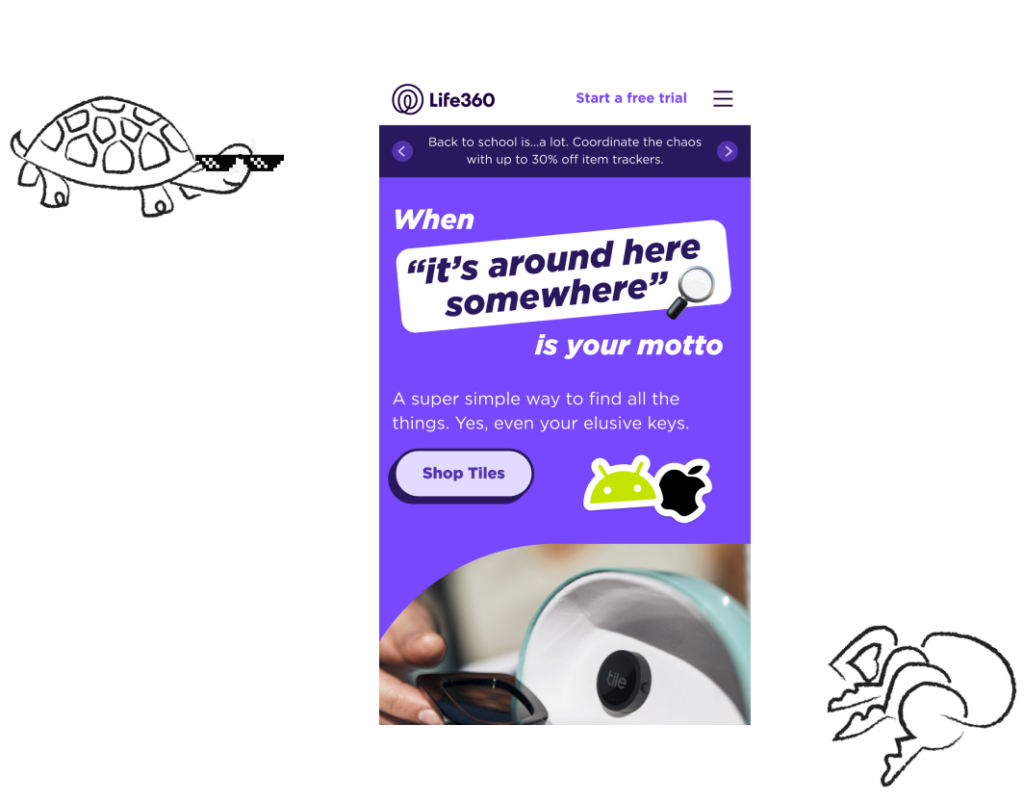
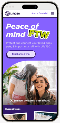
Life360 is a company that keeps families connected with mobile app services like location sharing, group chat, and safety features like roadside assistance. A few years ago they acquired Tile, a company that makes tracking devices for consumers, helping people keep track of their keys, bags and other items through their mobile app. Mentor collaborated with both the Tile and Life360 teams to create a design solution that would merge the companies’ two unique sites.
“Just wanted to send a quick note to say Thank You all for your hard work and keeping to super tight deadlines! Left to our own devices, it would have taken until Dec and likely not have turned out as well. Hugely appreciated! ”
KATY WALDEN – BRAND & GTM STRATEGY, LIFE 360
The Challenge
The goal of this six-week project was to rapidly test and validate a plan for combining both company’s sites into a unified experience, but merging two distinct websites with different objectives presented a significant challenge. There were two e-commerce pathways, both subscription and product purchase, and two different audiences with different needs and goals. We conducted focused user research to quickly validate design decisions and carefully considered various stakeholder viewpoints as we built out a new unified experience.
The Solution
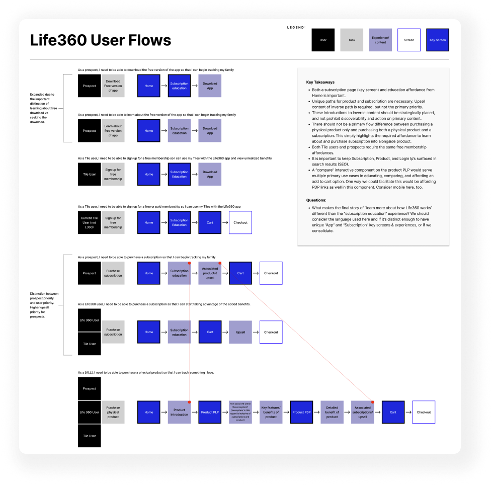
Discovery Workshop and User Flows
Key decision points were identified immediately upon kickoff, and working sessions were scheduled on day one. The outcomes of these sessions outlined the main tasks that users of both Life360 and Tile would need to complete after the two sites merged.
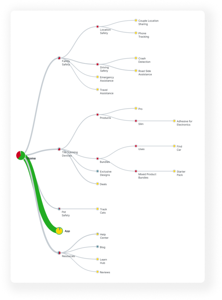
Content Audit, Information Architecture, Quantitative User Testing
Our discovery efforts informed an Information Architecture recommendation, which was quantitatively tested with users and updated based on their feedback. We learned that users preferred simpler navigation over more literal labels. “Items” and “Tiles” could be considered the same. Also, the “App” page should clearly explain the benefits of each plan and prioritize easily downloading the free version.
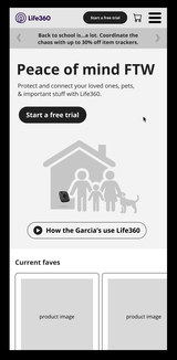
Prototype & User Testing
Armed with validated test results, we began visualizing our findings to prepare for qualitative user testing. The testing confirmed our initial direction, allowing us to make informed design updates, primarily to the membership page and checkout process.
UI Design
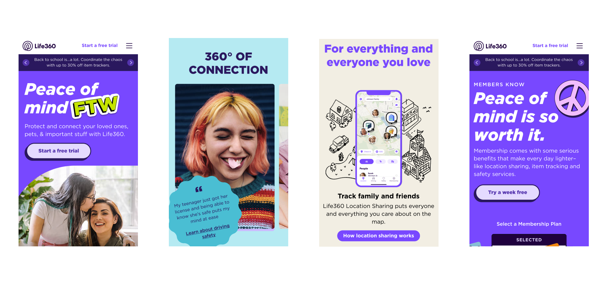
Custom hand-illustrated graphics, animations, and a cohesive visual language were used in our designs. Since Life360’s brand would be used going forward, Mentor made sure to closely match their style guide while also creating new, fresh visual concepts.
High Fidelity Prototype, Backlog & Next Steps
The user testing, user experience, and design work came together in a high-fidelity prototype and a backlog of next steps. This detailed plan, informed by our research and expertise, provided Life360 with a clear path forward. Each stakeholder team felt confident in the decisions made and that their specific needs were addressed.